|
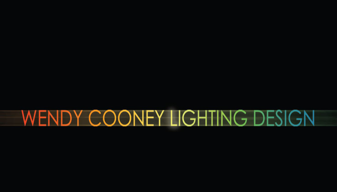
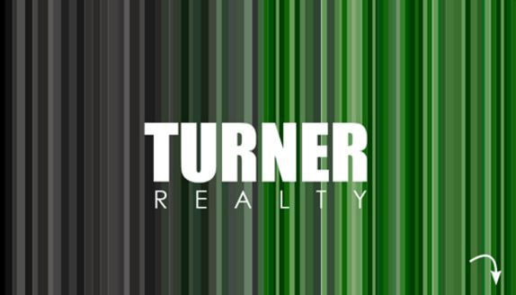
Contrast is a great tool that can add value to your design when used well. Its primary function is to highlight/emphasize a major difference. What you choose to contrast often becomes the focus. Years ago we used to design business cards. One of my favorites was one we made for a lighting designer. Normally business cards are white, one-sided, with the company name, position, and contact info. They make little attempt to foster connection through the look and feel of the card. But can business cards connect with us? Can they create an emotional response? Can the exchange of cards create a moment between people? Yes, yes, and yes. The card pictured below is a great example of how good design helps us convey an idea. The front features only the client’s name colored with the full spectrum of light, with the center “L” highlighted like a lightbulb, all set on a black background. The concept of color and light comes through in this card design, connecting lighting design with the client. Contrast works best when you set up a pattern that you can break. For example, a lone tower becomes more recognizable and compelling when sitting in the presence of shorter buildings. It is best to use contrast to highlight an important aspect of the design. In buildings, this could be a stairwell, a large space, or a meaningful change. When sketching objects that are closer you can use heavier lines and darker shading to contrast from objects that are farther away. When entering a building, you can lower the ceiling of the entrance thus providing a feeling of compression and transition. You can release that tension by immediately opening up to a taller space after the entry. We designed another business card for a local real estate agent that was celebrating its 50th anniversary. The concept was contrasting old (black and white) with new (their company colors). The company name with the small arrow in the lower left let the recipient know to flip over the card for information. Both these business cards used one side to graphically convey a message / idea that could sick in the consumers mind. The reverse side provided contact information. consumers mind. The reverse side provided contact information. At F9 Productions, the first cards I designed, coveys our logo ghosted in the background along with my contact information on one side. How can you convey an idea through contrast? How can you use contrast to highlight a thought? If you are interested in learning more about design principles check out my book The Creativity Code.
0 Comments
Leave a Reply. |
ArchivesCategories |


 RSS Feed
