|
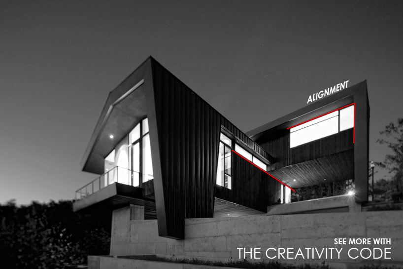
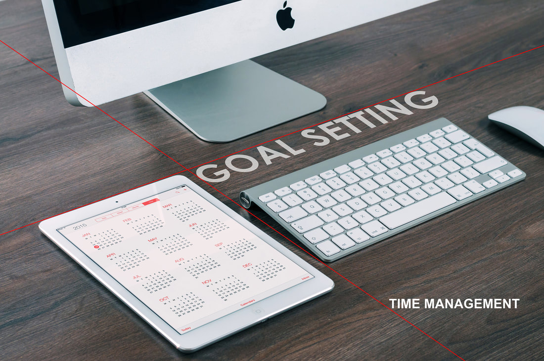
Watch why we wrote the Creativity Code, how it can help you, and some great bonuses for purchasing! Alignment along with grouping are the two most powerful design principles you can apply to your projects. There are two types of alignment. You can have obvious alignment as seen in the image below. The windows in the center of the page align with the bottom of the second floor. The windows to the left align next to the vertical steel element that becomes the roof. Skylab architecture Skyline house. Photo by: Skylab Architecture: http://www.designboom.com/architecture/skylab-architecture-skyline-residence/ Or you can have hidden alignment. Hidden within this image is the alignment of the “Goal Setting” text with the iPad and keyboard. “Time Management” sits in the open space while the “T’s” heel rests on the guideline. Use your environment to guide your placement. TAKEAWAY
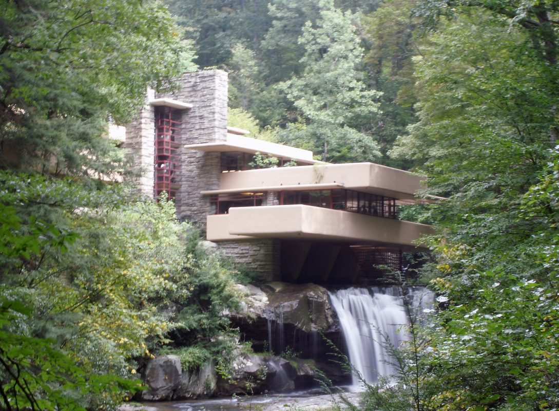
Most designs start with many variables, whether you are putting together a PowerPoint, organizing tasks, or placing windows on the exterior of a house. Taking another look at where you can group and align objects could do wonders for your project. From a broader perspective, Alignment is about aligning the method, tools, and materials to the outcome you are targeting. If you are doing a creative project, does your process reflect your desired outcome? If you are creating a building that conveys strength, do your material choices reinforce that concept? If spending time with your family is important, does your calendar align with that goal? Find more insight in The Creativity Code Design often starts as many fragmented pieces. Your job is to group those pieces into an aesthetic and valuable whole. When designing a house, for example, you must consider the organizing rooms in conjunction with coordinating: materials, windows and doors. Frank Lloyd Wright provides us with an excellent example of how to group elements in his design of Falling Water, a house in Pennsylvania. Here you can see the exterior is simplified by using three material choices: stone, stucco, and glass. By doing this, he reduces the elements his mind needs to organize and can thus focus on refinement and creating a system that works. Frank also simplifies by creating rules.
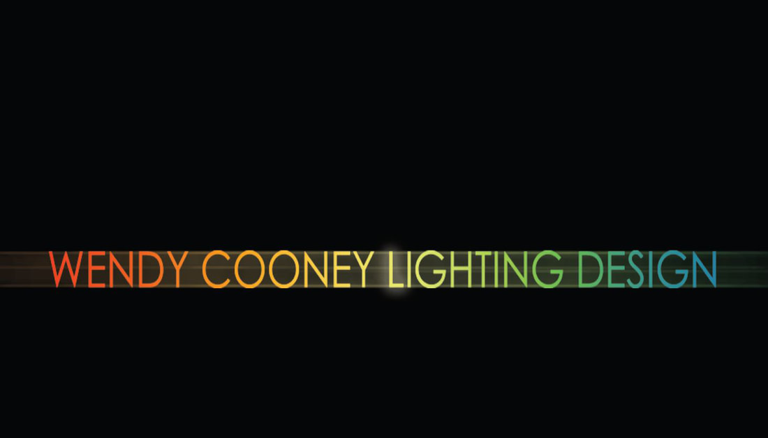
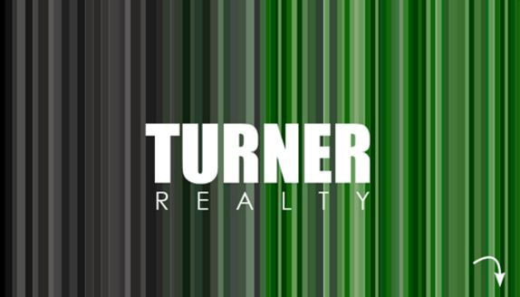
#1 - All horizontal elements in a stucco material. #2 - All vertical elements are made of stone. #3 - Glass is the glue that fills the gaps These rules create a cohesive whole. You will notice that the glass is not “punched” in walls creating holes of light, but grouped in vertical and horizontal slivers of light. By simplifying and creating rules, he was able to make a creative and complex design from simple rules. Grouping is not just an aesthetic principle, you might know it best as an organizing principle. Grouping tasks, items, or projects together can create better efficiency. If something feels off about a project or design look at it through the lenses of grouping and see if this organizes the project better. As a teacher at the University of Colorado Boulder, this principle along with next week’s principle, makes my job easier. I can often look at a project, scan over the elements, and suggest grouping certain elements. When the students move the items on the screen, they light up at the improvement this simple suggestion made. If you are looking to take your design game to the next level. Pick up The Creativity Code for a deep dive into the power of visual thinking. Contrast is a great tool that can add value to your design when used well. Its primary function is to highlight/emphasize a major difference. What you choose to contrast often becomes the focus. Years ago we used to design business cards. One of my favorites was one we made for a lighting designer. Normally business cards are white, one-sided, with the company name, position, and contact info. They make little attempt to foster connection through the look and feel of the card. But can business cards connect with us? Can they create an emotional response? Can the exchange of cards create a moment between people? Yes, yes, and yes. The card pictured below is a great example of how good design helps us convey an idea. The front features only the client’s name colored with the full spectrum of light, with the center “L” highlighted like a lightbulb, all set on a black background. The concept of color and light comes through in this card design, connecting lighting design with the client. Contrast works best when you set up a pattern that you can break. For example, a lone tower becomes more recognizable and compelling when sitting in the presence of shorter buildings. It is best to use contrast to highlight an important aspect of the design. In buildings, this could be a stairwell, a large space, or a meaningful change. When sketching objects that are closer you can use heavier lines and darker shading to contrast from objects that are farther away. When entering a building, you can lower the ceiling of the entrance thus providing a feeling of compression and transition. You can release that tension by immediately opening up to a taller space after the entry. We designed another business card for a local real estate agent that was celebrating its 50th anniversary. The concept was contrasting old (black and white) with new (their company colors). The company name with the small arrow in the lower left let the recipient know to flip over the card for information. Both these business cards used one side to graphically convey a message / idea that could sick in the consumers mind. The reverse side provided contact information. consumers mind. The reverse side provided contact information. At F9 Productions, the first cards I designed, coveys our logo ghosted in the background along with my contact information on one side. How can you convey an idea through contrast? How can you use contrast to highlight a thought? If you are interested in learning more about design principles check out my book The Creativity Code.
Creativity leans more on investigating the questions you ask first, before seeking a solution. Those who seek deeper meaning ask the most profound questions. They develop a superior understanding of solutions and advance faster. Design is not an exclusive tool for the creative class, but it is something everyone can use. ASK THE RIGHT QUESTIONS. The most important thing you can do when you start a project is to spend time making sure you’re solving the correct problem. People can spend weeks, months or even years going down the wrong path. Investigation is the crux of creativity. It about spending the time to find the actual problem you are trying to solve. By using your understanding of the problem, and asking deeper questions you can converge on the best solution. Great leaders ask great questions. From The Creativity Code Find it here: http://amzn.to/2fakd45. |
ArchivesCategories |


 RSS Feed
